Scared the crop out of me
June 24, 2016
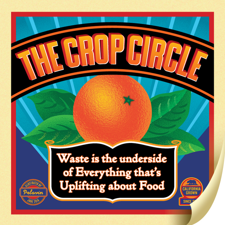
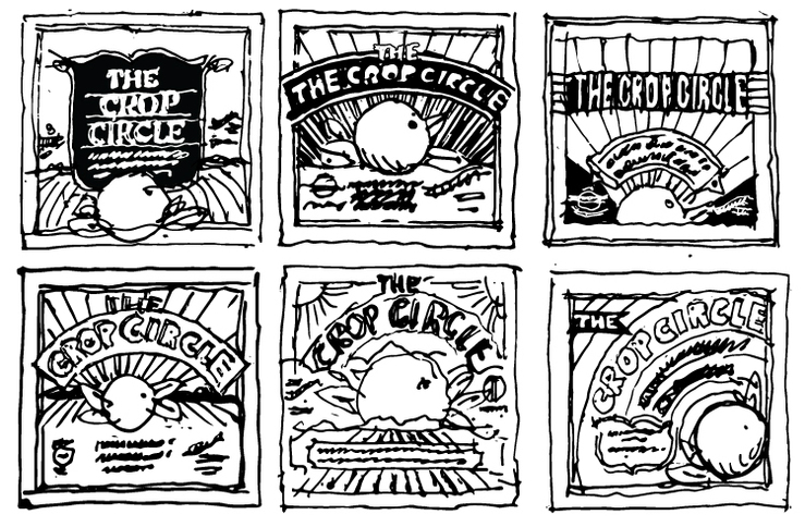
In addition to enamel signs, matchbook covers, cigar bands, vintage tins and more, fruit crate labels hold a lofty position among the inspirations for my work. Their deep, rich colors and decorative typography provide a splendid tableau to tell a story that delights as well as, informs. The perfect lockup is, of course, a story about farming or produce as was the case for a recent article in the storied Los Angeles Magazine.
I was pleased (and surprised) to be able to introduce some textures reminiscent of the originals which were printed in a multitude of colors from hand-rendered plates. The credit for the orange peel goes to Adobe's Illustrator's distort/glass filter and the shading on the leaves, to the Andromeda Screens plug-in in Photoshop.